Portfolio
Somma
A bold brand identity for a growth-focused business, built around momentum, ambition, and the letter S.
Portfolio
Setting The Stage
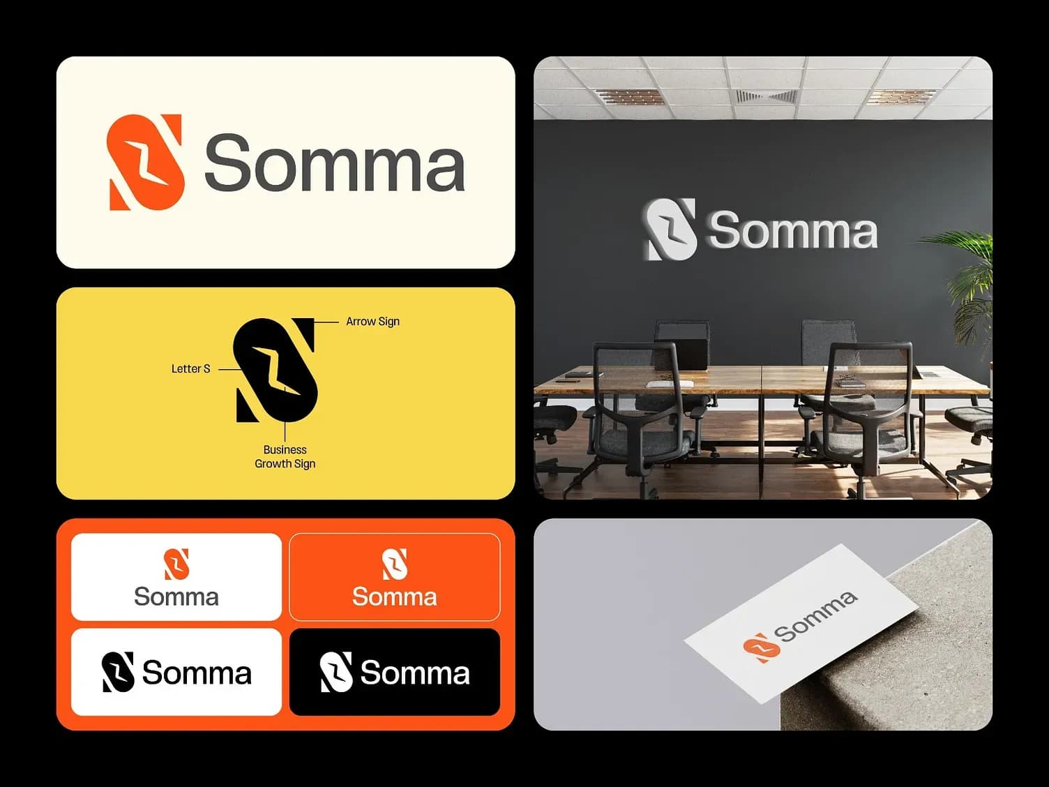
Somma is a business consulting firm focused on growth strategy for mid-market companies. The brand needed to communicate energy, precision, and upward momentum, qualities that are easy to claim but hard to make visual. We designed a logomark built around three interlocking ideas: the letter S, an arrow sign suggesting direction and speed, and a business growth sign. The result is a mark that reads as both a wordmark and an icon, adapts across every application, and tells a story at a glance.
Challenge We Faced.
Logo design for consulting firms is a minefield of clichés: rising arrows, handshakes, abstract squares. The challenge was creating something that communicated 'business growth' through intelligent design rather than generic symbolism, a mark that clients would be proud to put on their office wall and their business card simultaneously.
Our Approach & Process
Research & Strategy
Brand strategy workshops surfaced three core values: Momentum (we move fast), Precision (we get it right), and Scale (we think big). The logomark was constructed to embody all three, the S has implicit forward lean, the arrow is decisive, and the proportions are built on a geometric grid.
Design & Development
The mark was constructed on a 12-unit geometric grid. Seven logomark variations delivered: primary, secondary, monochrome, reversed, stamp, favicon, and embossed. Each tested at 16px and at billboard scale.
Branding Elements
Primary orange-red with charcoal secondary and off-white tertiary. The yellow accent energises the core palette for marketing applications. Dark Grotesque typeface pairs precision with approachability.
User Experience Considerations
Brand rollout applied across: business cards, office wall signage, letterhead, email signature, LinkedIn profile, and pitch deck template. Full usage guidelines in a 48-page PDF and Figma source file.
Project Outcome
Somma's rebrand coincided with a company growth phase that saw them double headcount within 12 months. The new identity was cited by three new enterprise clients as a factor in their decision to engage. The office wall installation (shown in the brand mockup) became a recurring feature in their client-facing meeting room.
2×
Headcount growth post-rebrand
3
Enterprise clients citing brand as a factor
48pp
Brand guidelines document

FAQs
Questions Look Here
Yes. A good share of our clients are US-based teams who outsource digital marketing and web development to Pakistan for the cost and time-zone advantage.
It depends on scope. Book a call and we'll quote against your actual goals, not a generic package.
Yes. You don't need the full stack: SEO, a single website build, or one campaign is a normal starting point for most clients.
Karachi runs on PKT (UTC+5). We regularly schedule calls to overlap with US business hours. Ask us for a slot that works for you.
You'll hear from a real person within one business day, usually with a few clarifying questions before we schedule a call. No automated drip sequence, no sales script.