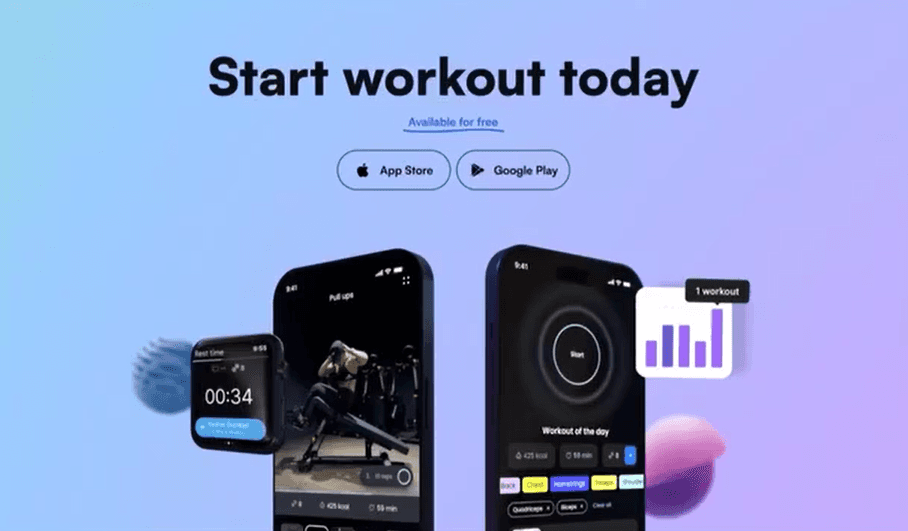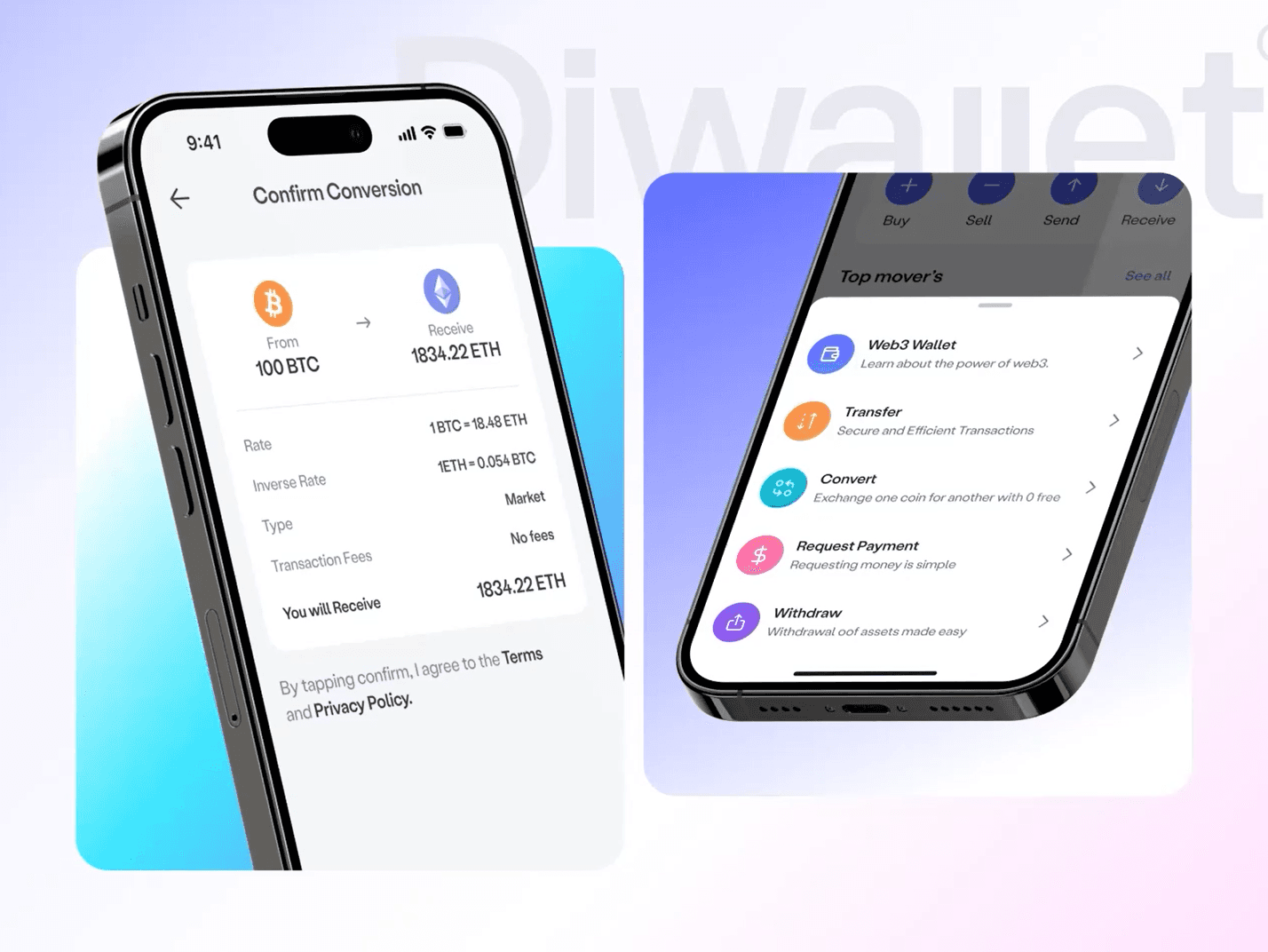
Responsive layouts get you to the starting line. But truly great mobile experiences demand a different way of thinking from day one.
Mobile-first design was a genuine paradigm shift when it was introduced. Start with constraints, scale up. It forced teams to prioritise, simplify, and think about the majority of their users who were accessing the web from a phone. It was the right idea at the right time.
But in 2026, mobile-first is the floor, not the ceiling. Users expect experiences that feel native to their device — not responsive web pages that happen to fit a smaller screen.
The Difference Between Responsive and Native-Feeling
Responsive design answers the question: 'does this work on a phone?' Mobile-native thinking asks a different question: 'would a user choose this over a native app?' The gap between those two questions is enormous.
“Responsive is a technical constraint satisfied. Native-feeling is a user expectation met.”
— David Chen
What Mobile-Native Actually Requires
Gesture-First Interaction Models
Desktop UIs are optimised for precision pointing with a cursor. Mobile UIs need to be optimised for thumbs — large, often in motion, frequently one-handed. Swipe to dismiss, pull to refresh, long-press for context menus. These patterns feel natural because they mimic physical interaction. Build them in from the start.
Perceived Performance Over Actual Performance
Users will tolerate slower loads if the UI responds to their input instantly. Optimistic UI updates, skeleton loaders, and micro-animations that acknowledge touch events all contribute to an experience that feels fast even when the network is slow. On mobile, perceived performance matters more than actual performance.
Context-Aware Features
Mobile users have capabilities desktop users don't: GPS, camera, biometrics, push notifications, offline mode. A mobile-native product thinks about which of these capabilities would make the experience meaningfully better — and integrates them intentionally, not as afterthoughts.
- Design tap targets at minimum 44×44px — no exceptions
- Test every flow one-handed, on a real device, outdoors in sunlight
- Use haptic feedback for confirmation of destructive actions
- Implement offline states for every data-dependent screen
- Treat the bottom of the screen as prime real estate, not wasted space
The best mobile products don't feel like websites that work on phones. They feel like they were born on the device. That's the standard to build for.